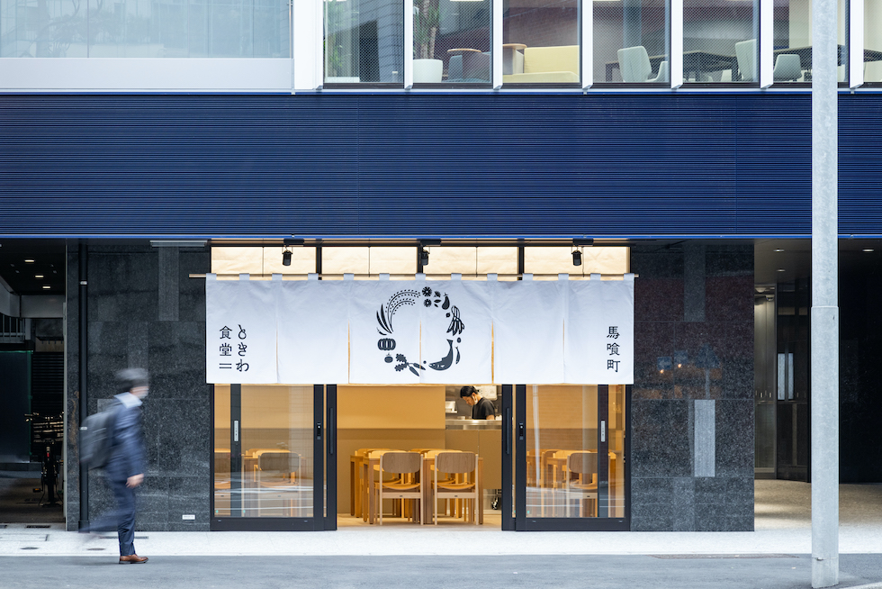
馬喰町ときわ食堂
Project Date
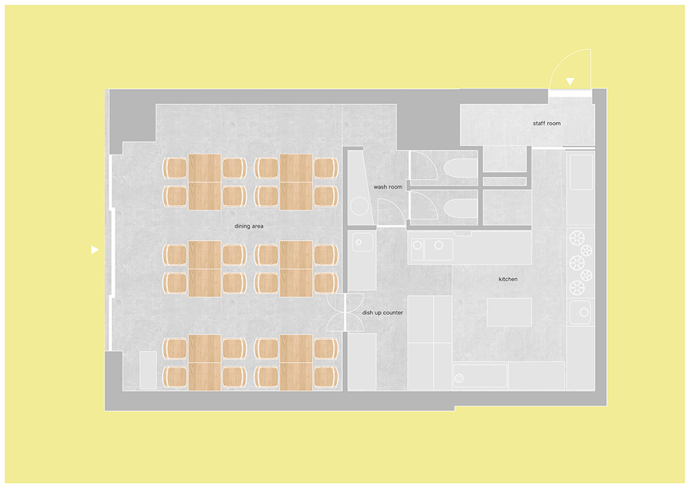
所在地:東京都千代田区
竣工:2022年
用途:店舗(和食)
対象面積:70.41㎡
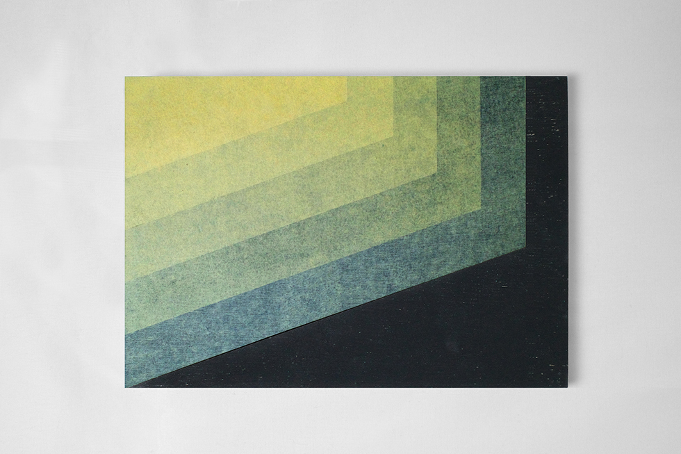
写真:Naomichi Sode(建物),UENOA(模型)
ロゴデザイン:ido 飯田将平
照明:ModuleX 麻田勝正
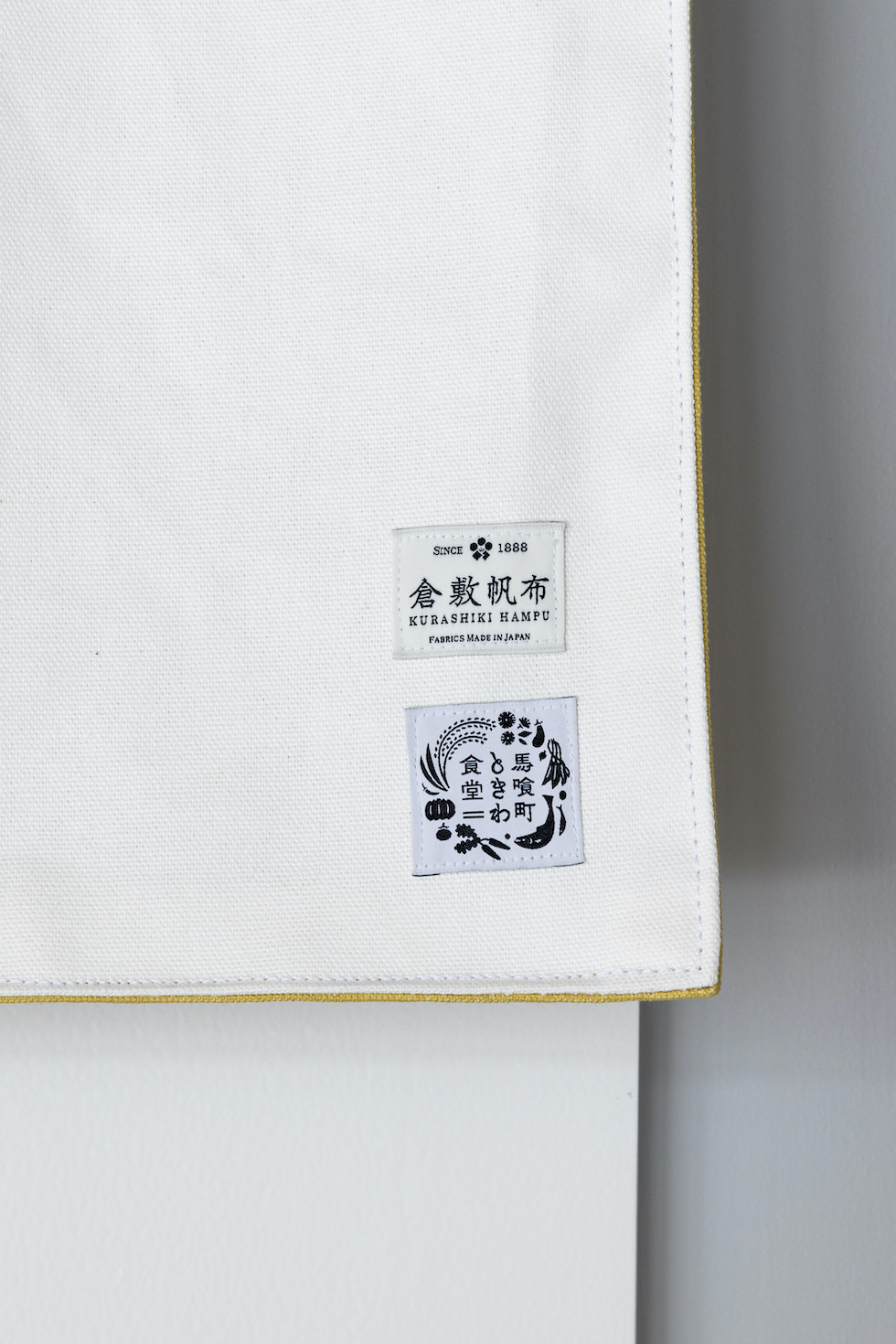
協力:倉敷帆布
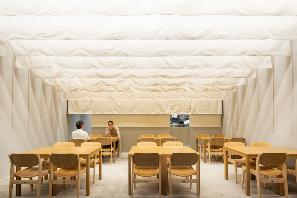
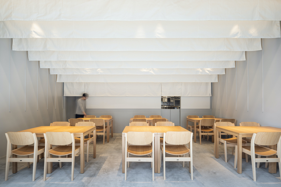
【柔らかく重厚な面】
創業100年を迎える老舗の食堂「ときわ食堂」の新店舗の内装計画です。
100年という伝統を守りながら次の100年に向けた新しさをつくり出すことをテーマに掲げ「暖簾」に着目しました。
日本独自の文化である暖簾は、元来日差しや視線を遮るために出入口に設置されていたものが鎌倉時代ごろから家紋といった独自の意匠を取り入れ始め「メディア」としての機能を持つようになりました。その文化は多様に変化しながら現代に至り、暖簾が店の営業を示すサインであることは日本人の共通認識として定着していると言えますし、「のれんを守る」という言葉があるように商売を生業とする者にとっては時間をも含んだ特別な存在となっています。
このように店先に掲げる暖簾がいくつもの意味を持つ記号であることに対して、ここでは内装にも暖簾を取り入れ、モノとしての暖簾の魅力を引き出したいと考えました。
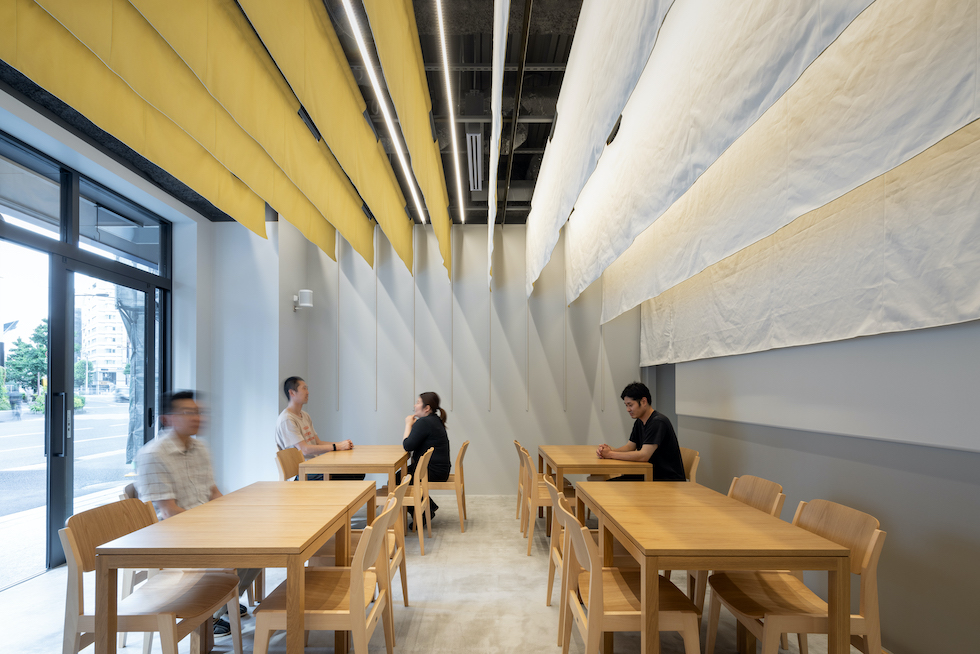
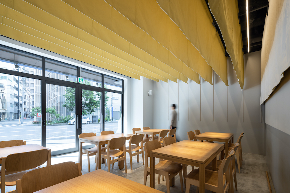
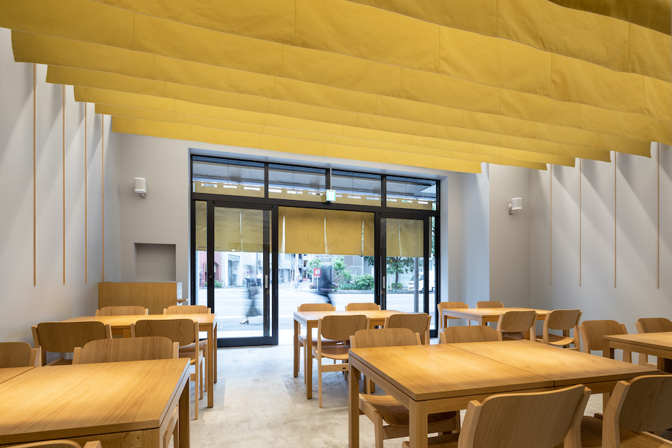
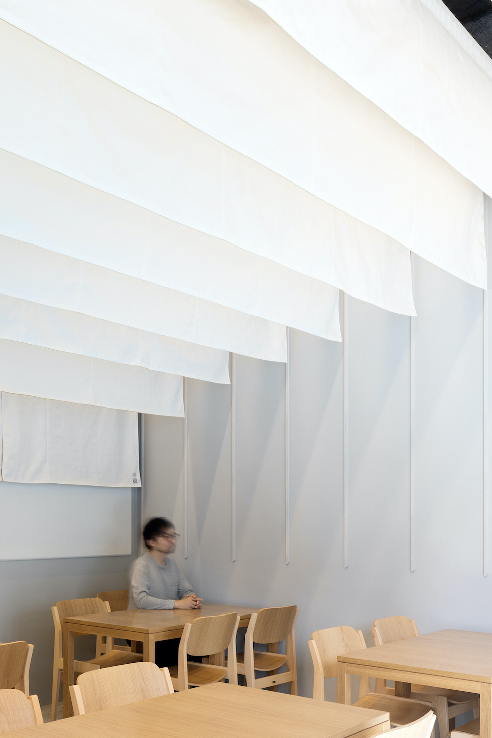
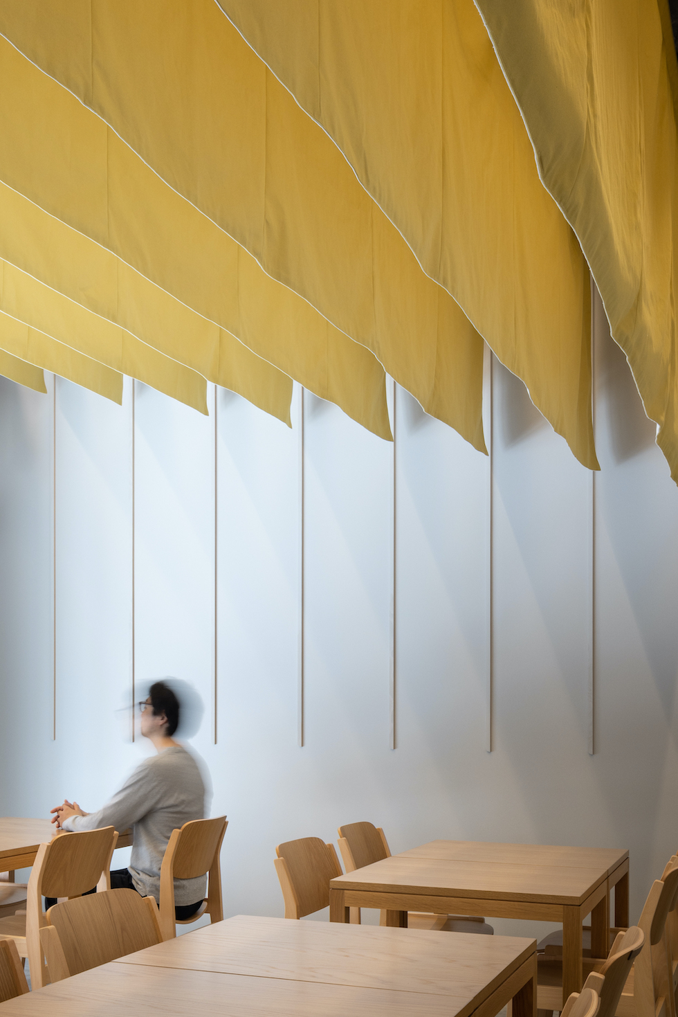
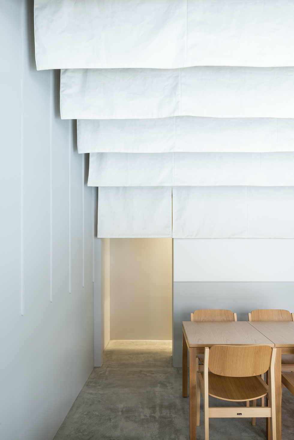
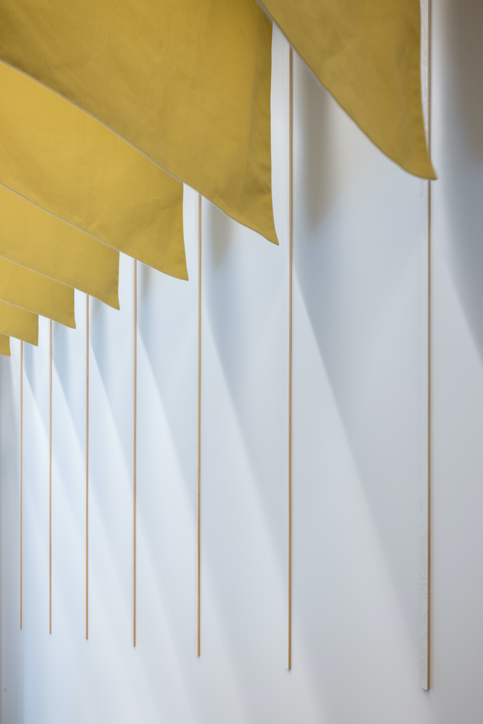
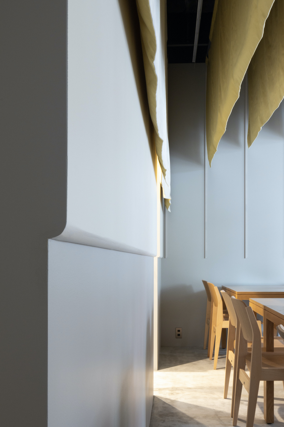
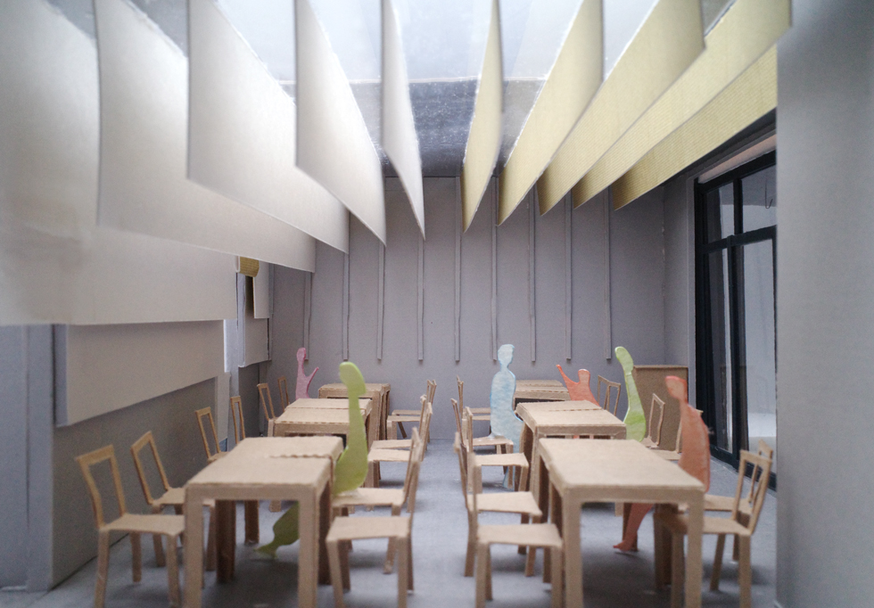
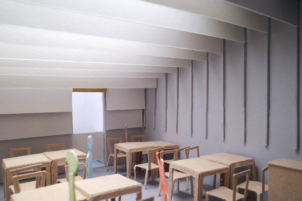
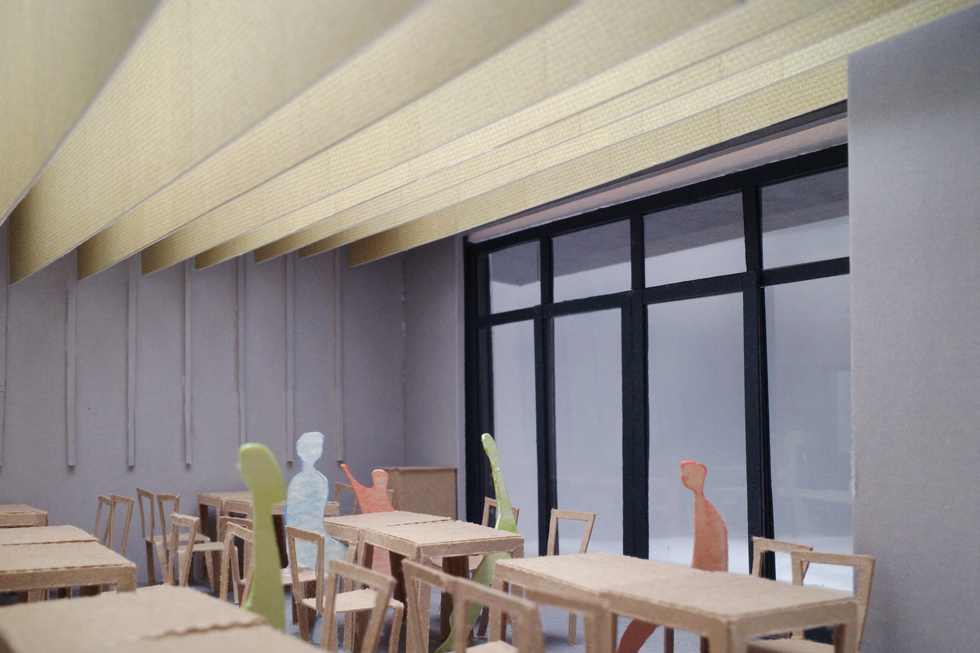
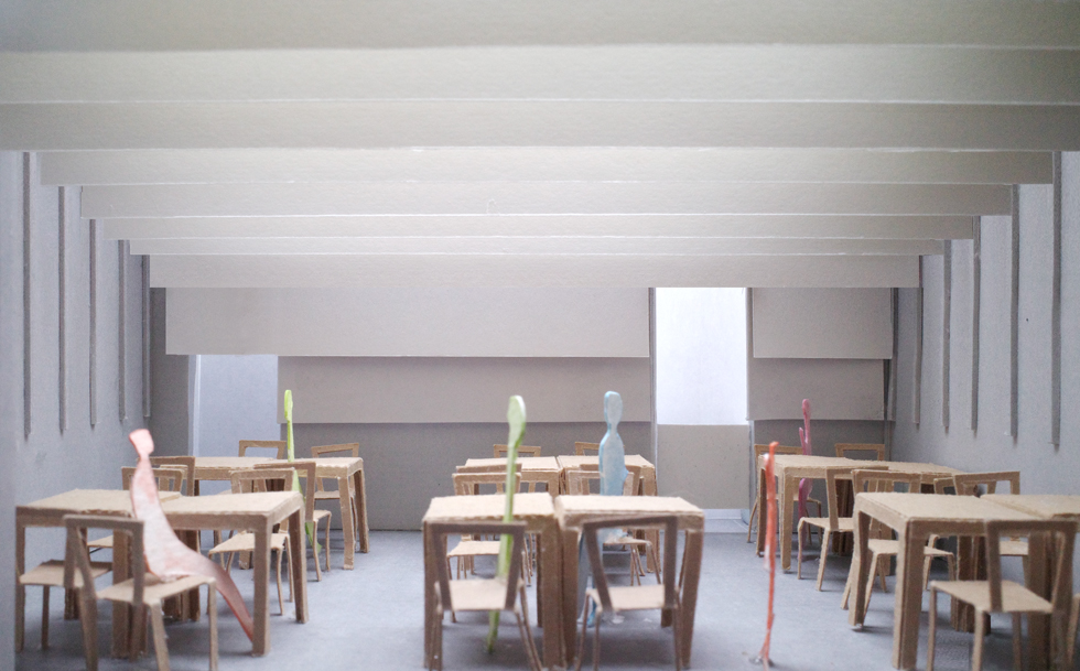
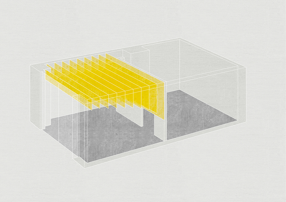
客席には10枚の大きな暖簾がレイヤー状に連続して提げられています。
一般的な暖簾は11号帆布を用いますが、内装に用いた暖簾はより厚さのある8号帆布を袋状に縫い合わせ、幅6mの非常に大きく重さのあるものとなっています。
これらの暖簾は、柔らかくそれでいて重厚感があり触れれば動くという、一般的な建材とは異なる物性を持っていて、壁ともカーテンとも違う暖簾でしかつくれない存在感を備えています。
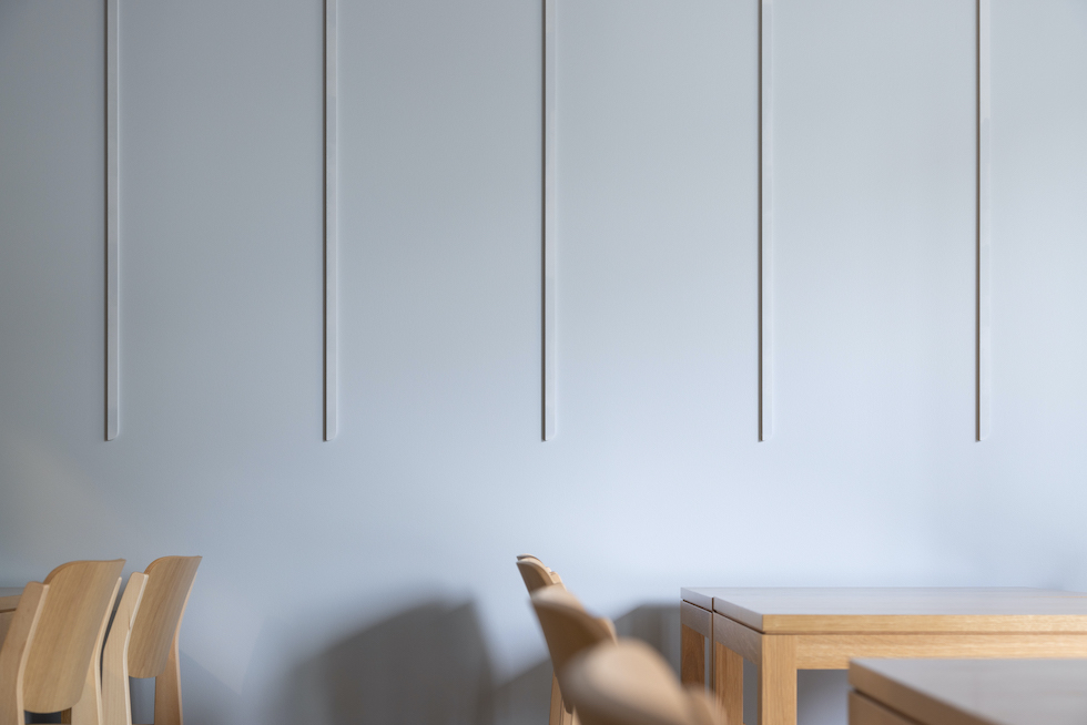
また、暖簾のオモテ面とウラ面には異なる色の帆布を用い、それぞれの長さは奥に行くほど長くなっています。
これにより通りから店に立ち寄ったときの印象と、席に座った時あるいは食事を終えて店を後にするときの印象が変わります。
食事をする背景として固定したものになりがちな客席にゆらぎを作り出すことを意図しており、硬く動かない壁面の塗り分けとは違い、実際に人が動くとゆったりと揺らぐ暖簾を用いることでよりおおらかなゆらぎがつくりだせるのではないかと考えました。
暖簾が持つ伝統を尊重しながら、暖簾と建築や内装への関係性の創出を試みました。
「和文化を通して日常を豊かにする」という店の理念を暖簾を通して体現できたのではないかと感じています。
Project Name:Restaurants in Bakurocho
Architect or Architecture Firm:UENOA architects / Yoshinori Hasegawa+Fumie Horikoshi
Completion Year:2022
Built Area:70.41 m²
Project Location:Tokyo,Japan
Photographer:Naomichi Sode(architecture),UENOA(model)
Logo design:ido Shouhei Iida
Lighting design:ModuleX Katsumasa Asada
Cooperation:Kurashikihampu
【Soft and massive surface】
This is an interior design project for a new restaurant of "Tokiwa Shokudo", a long-established diner that has been in business for 100 years.
We focused on the "noren," a traditional blind curtain, to create a new look for the next 100 years while preserving 100 years of tradition. Originally installed at entrances and exits to block sunlight or to shield people's eyes from the sun, the noren, which is a uniquely Japanese cultural element, began to incorporate unique designs such as family crests around the Kamakura period and began to function as a "media". The noren has become a common recognition among Japanese people that it is a sign that a store is open for business, and as the phrase "noren wo mamoru" ("to protect goodwill") suggests, it has become a special presence that includes time for those who are in the business of doing business. In this way, the noren displayed in front of the storefront is a symbol with multiple meanings, and we wanted to bring out the charm of the noren as an object by incorporating it into the interior design.
Ten large "noren" curtains are hung in a series of layers in the seating area. While a typical noren is made of No. 11 canvas, the curtains used for the interior are made of thicker No. 8 canvas, sewn together in a bag-like shape, and are very large and heavy, measuring 6 meters wide. These curtains are soft, yet have a sense of weight, and move when touched.
The front and back sides of the curtain are made of different colors of canvas, and the length of each side increases as one moves toward the back. The length of each side is longer the further back you go. This gives a different impression when you stop by the restaurant from the street and when you take a seat or leave the restaurant after finishing your meal. The intention was to create a sense of space in the dining area, which tends to be a fixed background for dining. Unlike the hard, immobile wall surface, the noren, which sways slowly when people actually move, is used to create a more relaxed atmosphere.
While respecting the tradition of the noren, we attempted to create a relationship between the noren and the architecture and interior design. We feel that we were able to embody the store's philosophy of "enriching daily life through Japanese culture" through Noren.